Photo Tip: Isolate Your Subject – Don’t Fill The Frame
One of the best photo tips I give someone is to leave empty space and isolate your subject, it’s not always best to fill the frame. It’s natural instinct to look at a person straight on, focusing on them as we speak or listen. So it’s only expected that taking a picture of them we do it the same way, straight on and having them to be the center of attention, or in this case the image.
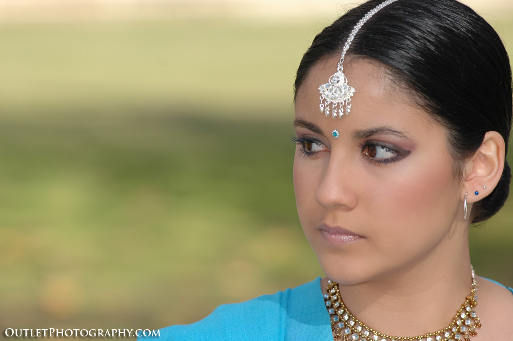
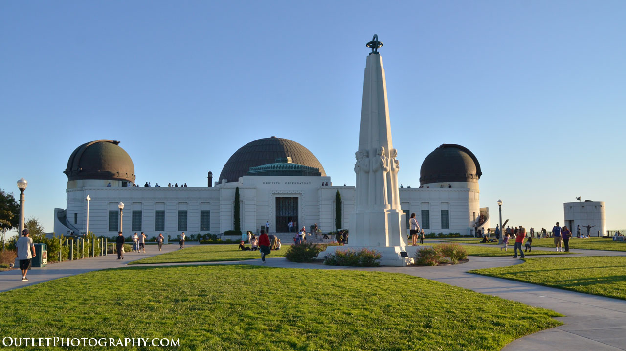
In the photo above, instead of taking a traditional vertical shot, I opted for a horizontal approach and positioned her to the right of the frame. I took two sets, one with her looking at me and a second (above) with her looking over to her right. The empty space brought more attention to her and what she was doing, which made the image much more interesting. I used this concept of empty space in a few pictures in my earlier post about photographing the Griffith Observatory.
The natural instinct for everyone is to snap a photo much like they would a relative or friend at a family vacation. However for most photographers, it’s more than capturing a moment, it’s creating a photo that one can be proud of showing. This is why most photographers call themselves artists, it’s because they do more than capture images, they create art.
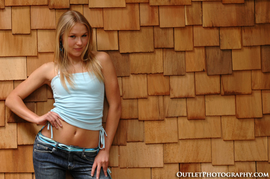
The brown shingles in the image above created an empty pattern of sorts, making an otherwise boring picture if I had shot it vertical with the model in the center. The space on the right isolates the subject and instead of capturing a picture of a girl, I created an interesting overall photograph.
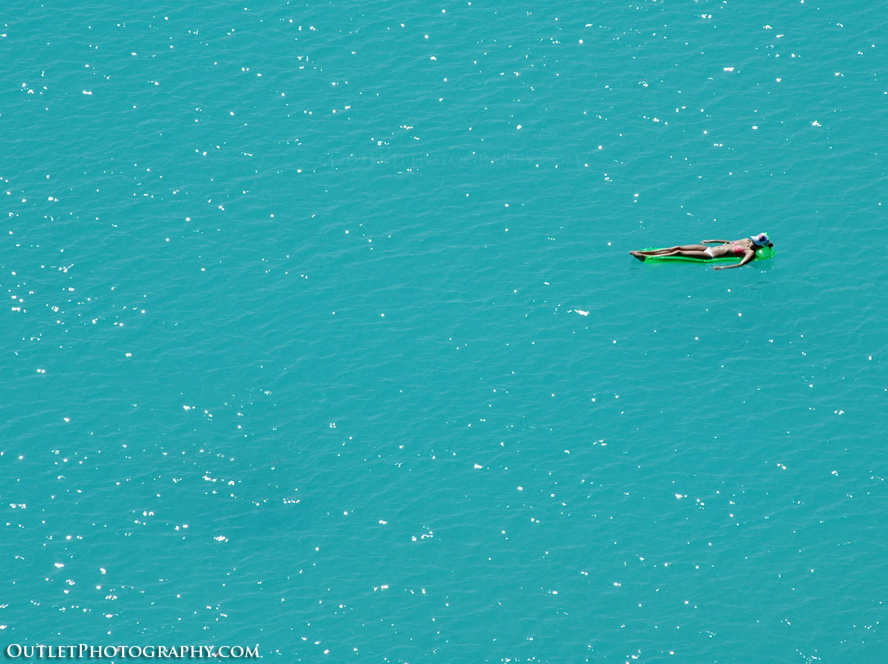
The original image above was taken in Hawaii overlooking a large lagoon. It was so large that it almost looked like the subject was in the middle of the ocean. Zooming in and filling the frame with the floating person did not give the allusion that I noticed from my perspective. So I simply took a wider picture, re-positioned her on the upper half on the right side.
The large area of water not only gave the sense that she was in the ocean but by isolating her, it brought more attention to her. This made the image much more interesting than simply zooming in and filling her with the photo.
So the next time you’re composing a picture, think about the subject as it relates to what is around it. Look at the empty space and don’t fill the frame, it may be the difference between a “good” or “great” photo.
